Melius Brand Guidelines
A compact reference for using the Melius identity across product, marketing, and partner moments.
Overview
The space between idea and execution.
The identity evolves around a node-based mark: connected, responsive, and built for creative work that branches instead of moving in one straight line.
New node-based logo.
Move away from the monogram and center the system around the connected Melius mark.
Iterative creation.
Every output can become a starting point to adjust, branch, and refine across connected nodes.
A practical system.
Logo, color, typography, graphics, and product UI should feel like parts of the same creative canvas.
Logo
Core marks and lockups.
Use the mark and wordmark with enough room to breathe. The horizontal lockup is the default; the vertical lockup is reserved for centered or square compositions.
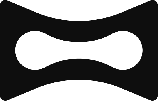
Symbol
Use for compact placements like avatars, favicons, app icons, and cursor-led moments.

Wordmark
Use when the Melius name needs to be read clearly without a larger brand frame.

Horizontal lockup
Use as the default lockup for headers, footers, press materials, and partner layouts.
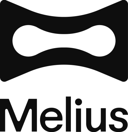
Vertical lockup
Use for centered brand moments, event graphics, and square-format placements.
Give it clear space.
Keep at least one symbol-height around the mark whenever possible.
Protect contrast.
Use black on light surfaces, off-white on dark surfaces, and orange only when legibility stays strong.
Do not redraw.
Do not stretch, outline, rotate, add shadows, or rebuild the mark with other geometry.
Color
A grounded palette with sharp accents.
The system starts with black, off-white, and orange. Neutrals support product clarity; accents are for diagrams, examples, and moments that need more range.
Color
Color Usage
Typography
A clear split between expression and utility.
The type system is bold at brand scale and calm at product scale. Use display type for big ideas, then shift into interface and body styles for decisions, labels, and guidance.
Reckless Standard M
Reckless Standard:
Regular
Usage:
Headlines.
Exactly as you imagined.
AaBbCcDdEeFfGgHhIiJjKkLlMmNnOoPpQqRrSs.
0123456789!@#$%^&*
FG Futurist
FG Futurist:
Regular
Usage:
Sub-headlines.
Navigation.
Iterate & Scale.
AaBbCcDdEeFfGgHhIiJjKkLlMmNnOoPpQqRrSs.
0123456789!@#$%^&*
Ease Standard
Ease Standard:
Regular
Usage:
Body copy. Details. CTAs.
Creation rarely happens in one pass. With Melius, every output becomes a starting point—adjust, branch, and refine across connected nodes until the idea reaches its strongest form.
AaBbCcDdEeFfGgHhIiJjKkLlMmNnOoPpQqRrSs.
0123456789!@#$%^&*
Art direction
Where ideas multiply.
Use imagery to show the range of creation: lived-in scenes, product-like objects, and abstract generative states. Keep the work vivid, spacious, and a little in motion.
Imagery.
Use imagery to show the range of creation: lived-in scenes, product-like objects, and abstract generative states. Keep the work vivid, spacious, and a little in motion.

Lifestyle and scenes.

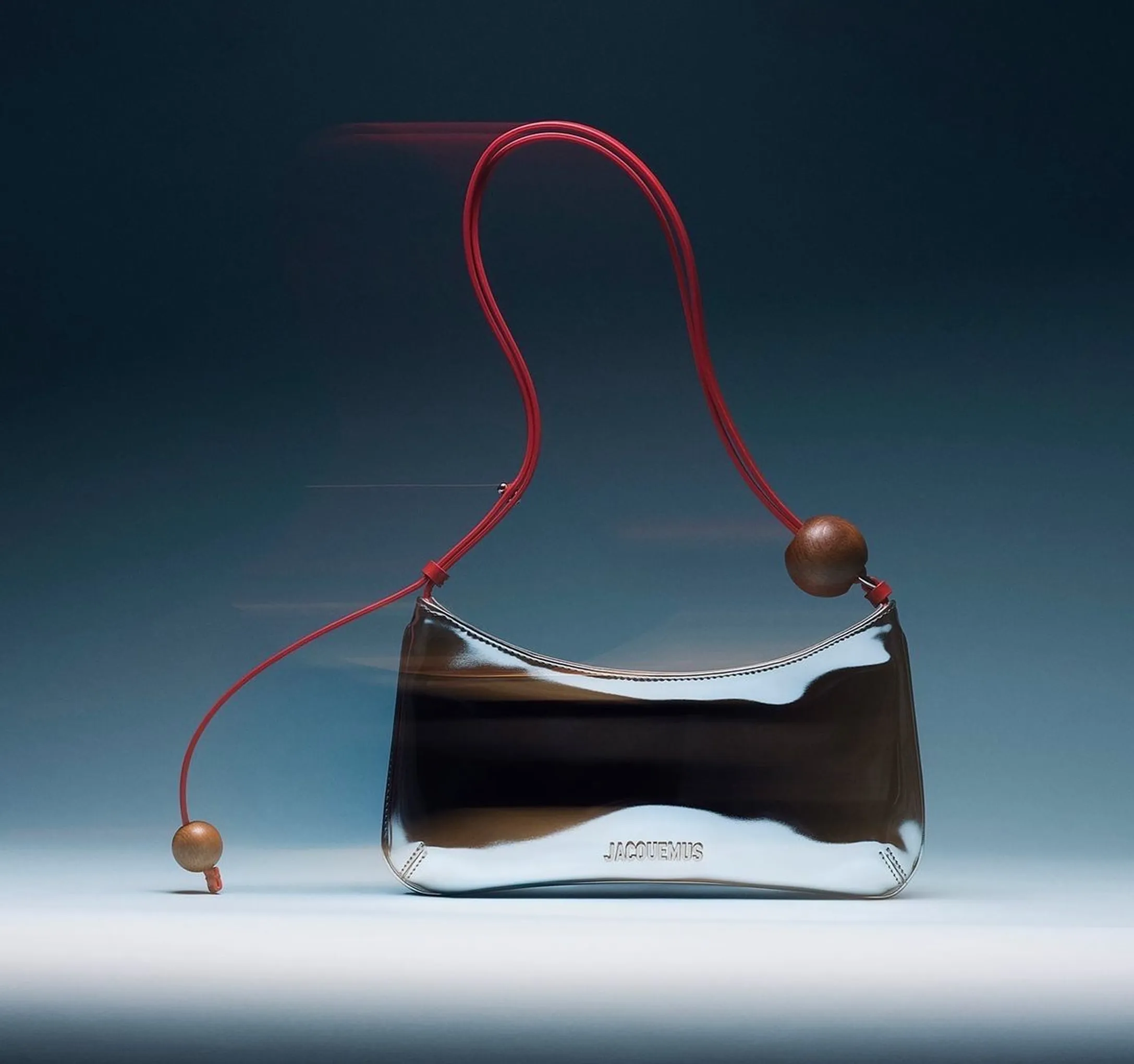
Product and objects.
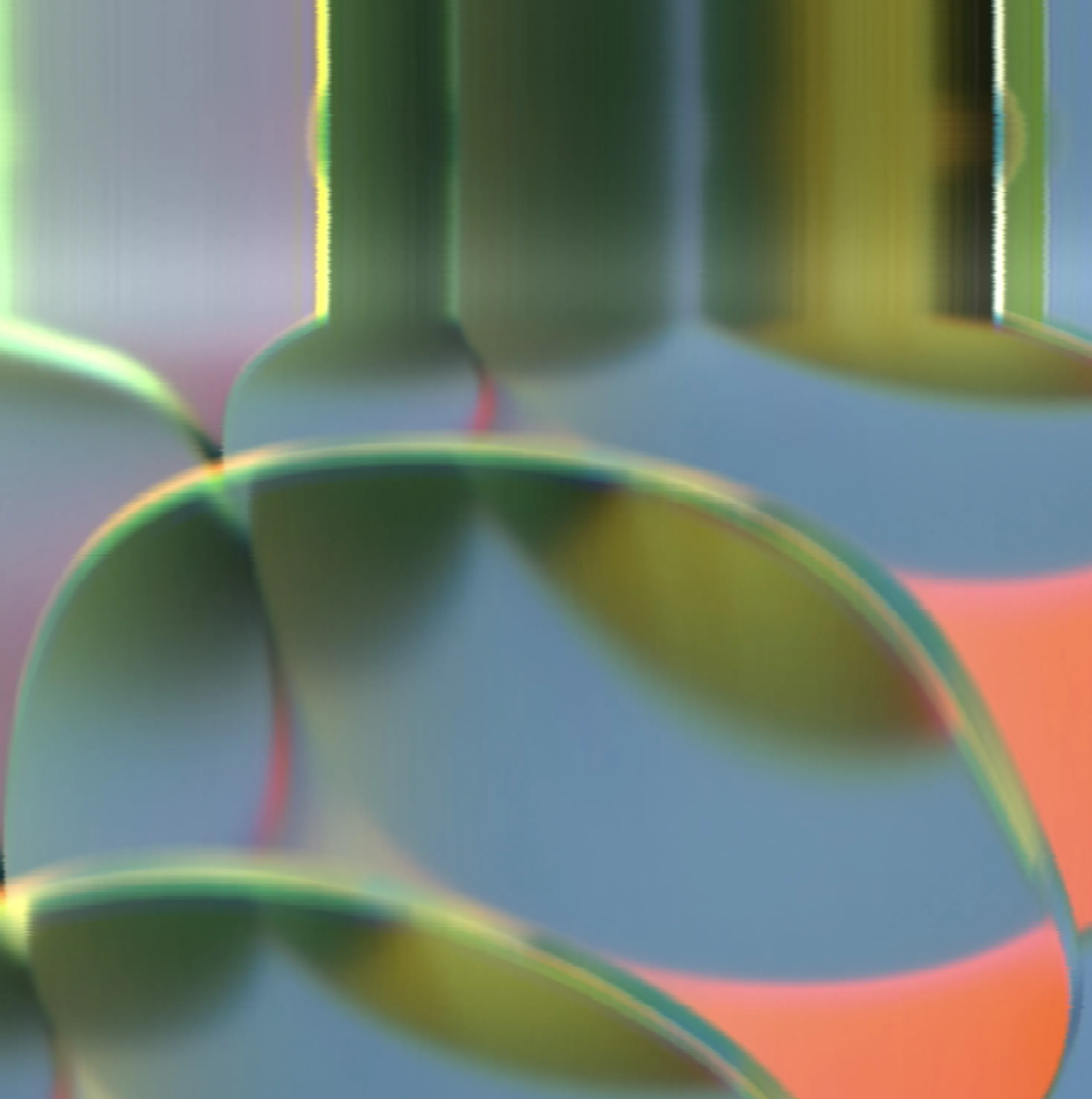
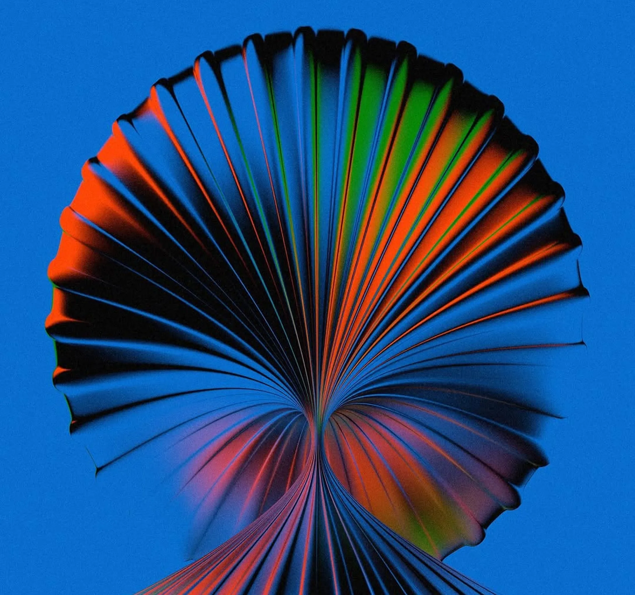
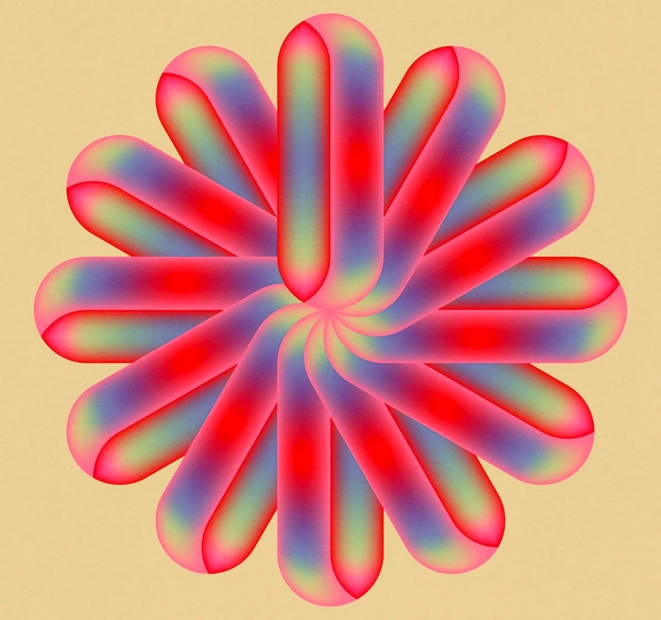
Abstract.
Color.
Let orange lead when color is the story, supported by cool blues, greens, or neutrals. Avoid flat single-color scenes; the palette should feel luminous and layered.

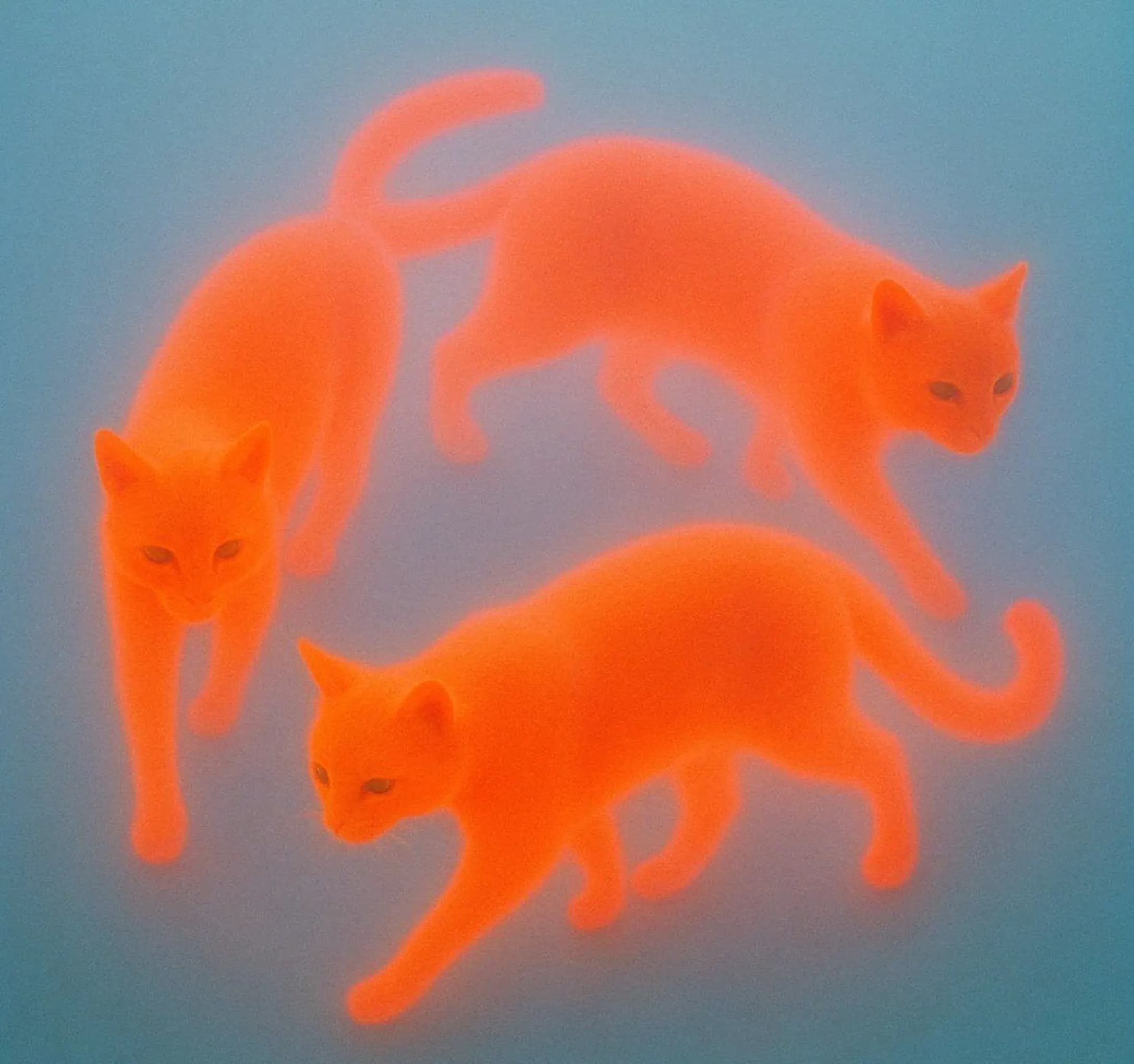
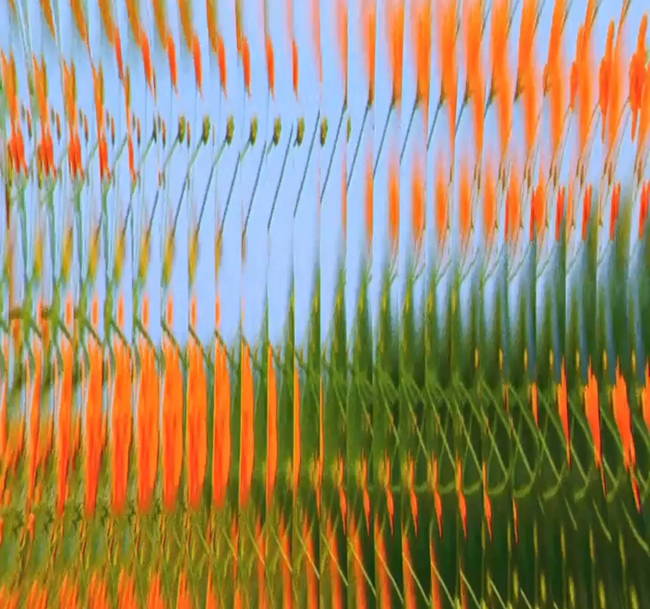

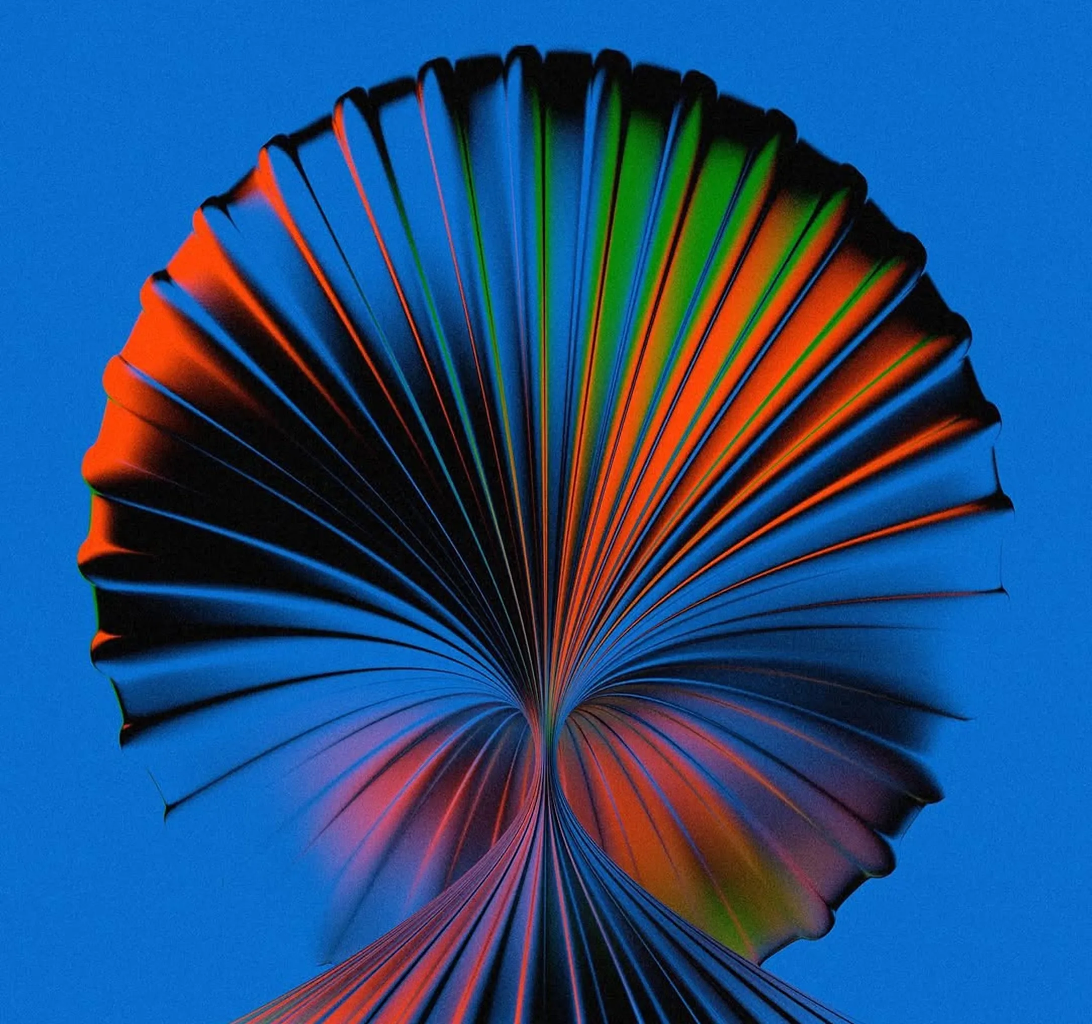
Distortion.
Use blur, scan lines, glow, or softened movement to suggest generation in progress. Effects should add energy without obscuring the subject.

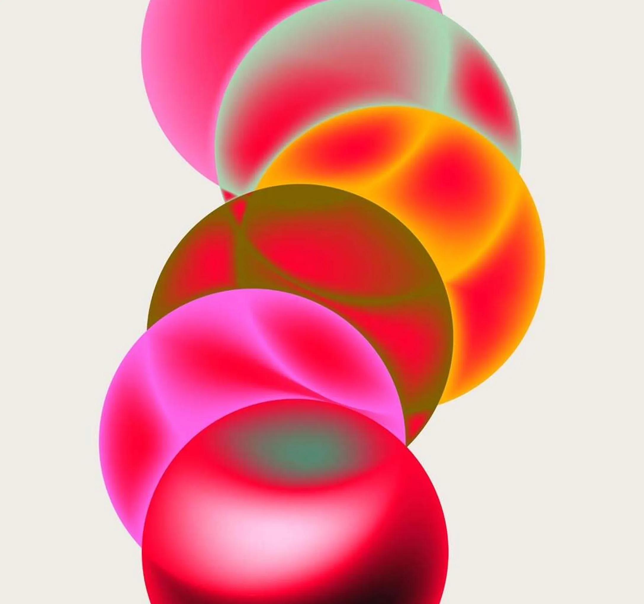
Gradation.
Use chromatic shifts, gradients, and edge fringing to create depth. The effect should sit between photography and illustration, not feel like a filter pasted on top.

Usage
Simple rules for consistent use.
Use these rules when creating a new Melius page, asset, deck, or partner placement.
Do
Use approved lockups.
Choose the symbol, wordmark, horizontal lockup, or vertical lockup based on the available space so the brand stays immediately recognizable.
Do
Build from product ideas.
Reference nodes, prompts, cursors, outputs, and branching paths because the system should feel connected to creation.
Do
Keep copy direct.
Prefer short, confident language that connects imagination with execution without explaining too much.
Don't
Do not overdecorate.
Unrelated ornaments make the system feel generic and pull attention away from the creative workflow.
Don't
Do not recolor freely.
Arbitrary gradients and low-contrast colors weaken recognition and make the mark harder to read.
Don't
Do not crowd layouts.
Crowded compositions make the brand feel technical instead of expansive, so give key elements room to breathe.